

People do two things online. They are either consuming content or navigating to it.
You want people to spend more time engaging with your content and less time struggling to find it. A great information architecture (IA) tells a story, creates flow, and aids discovery for the people using your products or services.
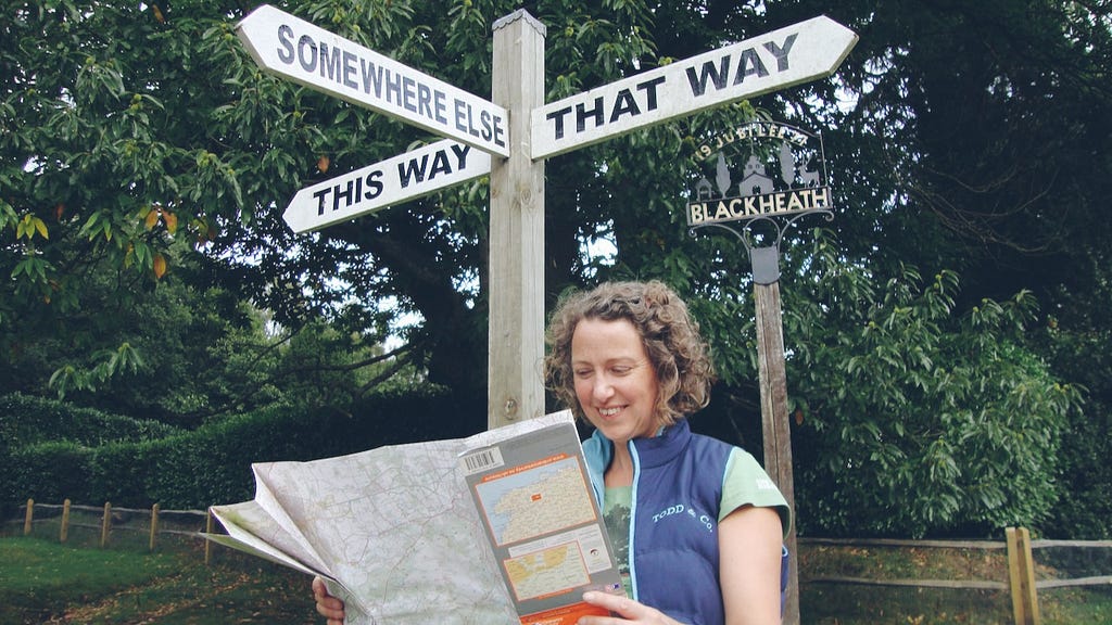
What do your users say about finding your content?
Here are some things I’ve repeatedly heard (or close variations of) in usability testing sessions.
“I can’t buy a product I can’t find on the site … it feels like to find anything I have to get my treasure map out.”
This is the moment the product team observing the session hit their heads on the desk or scream. A poor information architecture leads to a drop in sales.
“I’m not sure how I got here. I’m just going round in circles. I can’t find what I want to find. Perhaps it doesn’t exist.”
You’ve put effort into creating the content, but if it can’t be found, however well-written and designed it is, that effort is all in vain. Publishing content is not the measure of success; a user who consumes and acts on it is.
And from stakeholder interviews …
“When I need to find something on our website, I just use Google. I have no idea how our consumers find anything.”
How can you expect users to navigate your website when your colleagues who know the content exists find it an impossible task?
If you’re hearing similar things from your users and colleagues, then it’s time to take a hard, critical look at your information architecture.
Over the years of helping organisations improve the findability of their content, I’ve whittled down long checklists and many thoughts on information architecture to six key principles. They act as my guide for critiquing and creating a successful site structure.
Principles to shape your information architecture
1. The names and sequence of global navigation terms will determine the proposition, personality and story you are communicating.
What’s the story your primary navigation tells about your website? What’s your invitation and offer to the site visitor? What journeys into the site are you surfacing as the most useful for visitors?
2. Organise content around the key tasks of the intended audience and the way they think about and structure the information.
Why do users visit your website? What are their goals and tasks? What makes for a successful visit? Are the answers to these questions reflected in your navigation?
3. Restrict the number of choices in the primary navigation to create small, confident guided steps; a wealth of information creates a poverty of attention.
How many choices are you showing? How hard are the edges between the labels used? What can you prune to stop overwhelming users with a paradox of choice?
4. Having content found and consumed is more important than being represented in the global navigation.
What pages in the site structure are given prominence because they’re someone’s pet project? Which pages break the website’s organisational logic? What looks like it doesn’t belong where it sits?
5. Labels should be short, meaningful and consistent; use terms the audience understand, expressed in the way they speak.
When you listen to users, what words do they use? What labels do you have that use internal product names and organisational jargon? Where do you go to regularly listen to your users’ language?
Online forums, your call centre and service desks, shadowing your frontline and customer-facing staff, are all great places to discover the language your audience uses. A colleague of mine, Ellen de Vries, refers to this as ‘content harvesting’.
6. Create flow into, around and across a website by establishing and reusing organisational metaphors in a consistent manner.
What are the entities you use (e.g. a person, a place, an object, a thing) across your website? How do you connect them together? Where’s the list of entities saved, and how’s it shared across your organisation?
Taking a first step toward an improved information architecture
Your information architecture should be treated as a product rather than a project. It requires ongoing review to keep it optimised.
Take a look at my three-point check-up to spot the tell-tale signs that your information architecture needs attention before it becomes really broken.
We ask for two precious and finite things from site visitors: their time and their attention. Your information architecture should be designed and refined to help users spend more time at the destination and less time on the journey.
This article was originally published on the Clearleft website:
Yippee IA: Six principles for creating a successful information architecture was originally published in UX Collective on Medium, where people are continuing the conversation by highlighting and responding to this story.


