

Insights from products that grow and grow.

A few years ago, after running a complex global product launch, I wrote down everything I learned. To track my own ideas. To make sense of things. I’ve kept adding to it ever since.
I’ve worked on products used by a handful of people and products used by a meaningful percentage of the planet. The second kind taught me things the first never could.
This is what I’ve picked up along the way, writing for billions of users across dozens of languages, time zones, and cultures. Some of these lessons are about words. All of them are about people.
01
Most interfaces are mostly words. Take away all the text and screens stop making sense.
02
When you have a giant user base, people will interact with your product in ways you never intended. You’ll be shocked. You’ll also learn from them.
03
Good interfaces don’t need instructions. If you need to write things like “look for the arrow” or “scroll right,” the UI needs fixing. Words shouldn’t explain the design.
04
Naming features is hard. Renaming them is nearly impossible, especially if millions of people have already started using the product. You get one chance to get it right.
05
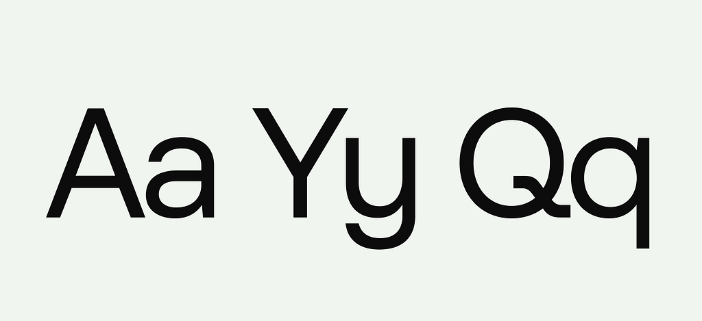
The typeface matters as much as the writing.
06
People have high expectations for software, and that includes the writing. World-class products don’t have mistakes, typos, or clunky phrasing.
07
Saying one thing is better than saying two or three things.
08
Fixing the writing can fix the entire company. Support tickets go down by the thousands. Conversion goes up. Users stay longer. There’s a reason the world’s best companies hire and value talented writers.
09
A shorter sentence is almost always a better sentence.

10
It’s always a good idea to fix things. You don’t need a rigorous business case for it. Don’t waste time trying to calculate the ROI of spelling “Connecticut” correctly.
11
People won’t read everything you put in the interface. They’ll skim and scan and scroll to what they want. You need to write for those people.
12
Rewrite everything twice. Rewrite important things twelve times.
13
Our relationship with technology changes. Writing can shape that change. Remember, we used to be afraid of using our real names online or entering our credit card.
14
Good writing just feels different. This can be hard to explain to non-writers. There’s a certain kind of click that happens in your head. Revise until you get there. You’ll know it when it happens. Developing this instinct takes a long time.
15
With a giant user base, you can get stuck trying to write “for everyone.” Try writing for one specific user. An Olympic athlete struggling to set a new record. A first-time mom who’s using your product at 4am. A surfer on their honeymoon in Tahiti. Choose one person and write.
16
Longer writing needs to be worth it. We expect more from a paragraph than a headline. Make everything the right length.
17
Users will read what you wrote, then do the exact opposite. It’s okay.
18
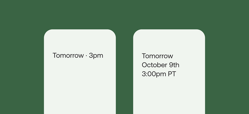
Details matter. The best teams spend time arguing over formatting and punctuation. Is it $45 or $45.00 or 45 (USD)? Do we say “July 5th” or “Next Tuesday”? Is it Settings or Preferences? You need to decide.
19
More opinions can sharpen your work.
20
Sometimes the last thing you need is more opinions.
21
A perfect error message is still an error message. Try to fix the root cause. Smarter inputs, clearer phrasing. An error is a last resort.
22
Words can’t do everything in an interface. Understand where other forms of information can help. A great description of a hotel room is no match for a photograph. A street address doesn’t show the same context as a full map.
23
Writing quality signals product quality. Users make judgments based on the writing. You can’t ask someone to trust you with their private data if they can’t trust you with your commas.
24
Small wins add up. A clearer headline here. A shorter error message there. A more direct call to action somewhere else. Fix enough little things and the product will completely transform.
25
Actions matter more than words. You can’t write one thing and do another. Don’t call it a “free trial” and then require a credit card. Don’t say chats are private if they aren’t. If you’re using writing to hide features or “convince” users, that’s a problem.
26
Most brand voice guidelines aren’t very helpful. Because most don’t say anything interesting or unique. Calling your brand voice “human” is not enough.
27
It’s usually a good idea to trust writers with writing. I’ve seen products fail because the wrong person was making decisions about words.
28
Grammar should be internalized. Learn the rules and break them when it feels right. But don’t talk about grammar too much. Using the phrase “past participle” in a meeting won’t get anyone excited. It’ll make them think of high school English class.
29
It’s hard to scale your product with a vague, meaningless value prop.
30
Tell the truth. I’ve seen a single vague sentence generate more support tickets than an actual outage. If something will take nine minutes, say it will take nine minutes.
31
Don’t invent words when you don’t need to. Digital products have a shared vocabulary that users already understand. Stick with common words and phrases. Log in. Save. Delete. Update. Edit.
32
Be careful about overwriting. This was something I saw lots of products doing for a long time, adding too much personality and too much text. Making a product “conversational” can sometimes just make it annoying to use.
33
A great onboarding will solve much more than an endless help center. First-time users who get confused don’t file tickets. They just leave.
34
You can’t evaluate writing in a spreadsheet or doc. Put the words in the interface and see how they read. Read them in the prototype. Read them on the device you’ll be using. Get as close to the real experience as possible.
35
Language is always changing. It happens faster than you think, and it’s the job of a writer to keep up. Look at the way people younger than you communicate, or the way your parents email. Nobody’s right or wrong. Language just moves.

36
Write without My or Your. Don’t call it My Photos or Your Photos. Just call it Photos. If you don’t, you’ll be chasing this down forever and confusing everyone along the way.
37
Writers who understand how products are built make better decisions. Learn as much as you can about strategy, technology, and business. A writer should understand how a company makes money and what their long-term vision is. Get as close to the decision-makers as possible.
38
Come back and read it tomorrow. Time away always helps.
39
If someone is using your product, they’ve already decided. Don’t market to them. You might talk them out of it.
40
Pick a word for something and use it everywhere, across every screen, for every user. Don’t call it a “folder” on one screen and a “workspace” on another.
41
Trust your own instinct as much as you trust your user research.
42
Users don’t know — or care about — your org chart. Your brand should have a single voice. It doesn’t matter if your emails, notifications, and support documentation come from different teams. Get everyone aligned.
43
Be careful with playfulness. A button that says “Pay” is clearer than one that says “Ka-chingggg.”
44
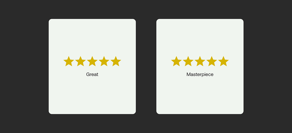
Word and image should work together. Give users context.
45
The things we build often reflect who we are. Selfish people build selfish products. Kind people build kind ones. To build the best product, build the best team and hire the right people.
46
Remember that translating for global products is a lot more complicated than swapping out text. Different languages reflect different cultures — and sometimes entirely different ways of thinking.
47
Be careful about making too many decks. You’ll start thinking in keynotes and bullet points, not UX and interface decisions.
48
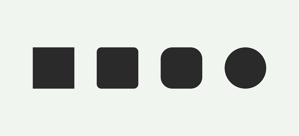
Language has power. Writing makes people laugh and sob and get angry and feel joy and connect with other humans. A gradient can’t do that. A date picker or corner radius can’t do that.
49
Sometimes words can convey multiple meanings. “New” can mean exciting, but also unproven. Calling a transaction “safe” might make the user worry. Think about every word and what else it might be saying.
50
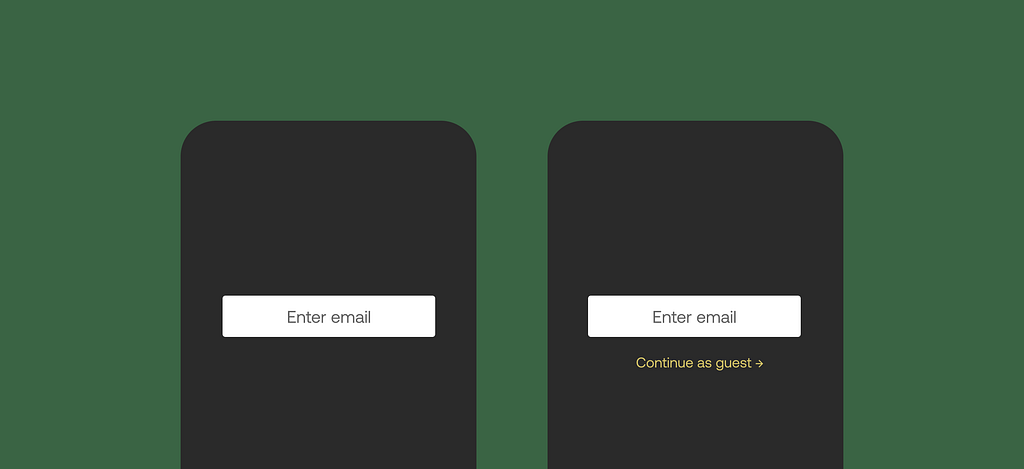
Not everything needs a login or account. Let people use your product. If they like it, they’ll stick around.
51
Not everything needs to be a subscription, either.
52
You get better by writing more. There’s really no shortcut to this one.
53
Know that your tools as a writer will keep changing. You’ll be working differently and using new software in 5 years. Maybe sooner.
54
One of the biggest challenges you’ll face is translating your product into right-to-left languages like Arabic or Hebrew. The entire UI starts to break. Icons, progress bars, and indicators might appear backwards. Build a writing system that can flex across all layouts and languages.
55
Never, ever mess around with money. There is no faster way to lose trust or infuriate a giant user base. Tell people what things cost. Don’t add “convenience fees” at checkout. Keep auto-renew off by default.
56
Good writing can’t fix a bad product. But it can reveal problems faster.
57
Get the first draft done. A bad draft is better than a blank screen.

58
Bringing writers in early is always a good idea. You can tell when a writer was added to the team the week before launch.
59
Delete as much as you can.
60
Good writing is not enough. You also need good layout, hierarchy, and typography.
61
The legal team will ask you to add words. Rewrite them so they make sense to regular people.
62
Laws are different everywhere. Required disclosures in Australia are different from those in California or the EU. Create different versions of the same screen if you need to. Don’t try to create one “hero version” that appeases everyone. It will end up being the clunkiest option.

63
Avoid the word “content.” It devalues everything it tries to describe. A film is not “content.” Writing is not “content.”
64
Users aren’t stupid. But they’re sometimes busy or distracted or tired.
65
Your writing will teach people how to think about your product. Clear language creates clear thinking. Vague or inconsistent language does the opposite.
66
Deliver bad news quickly and clearly.
67
Write for the user, not the press release or launch video. Too many companies get this wrong. They start with the marketing assets and then try to build the product around it. It usually doesn’t go well. Designing a screen for a keynote is different than designing it for a user, and great marketing won’t ever be able to fix usability issues.
68
It’s better to write something well the first time. A ten-second fix, multiplied across a billion sessions, is measured in years, not minutes.
69
If you’re making changes but things aren’t getting better, try fixing something other than the words. Use different components. Add animation. Adjust the navigation. Keep trying new ways to make the UI better. Don’t just rewrite. Rethink.
70
Accessibility can’t be layered on top of good writing. Turn on a screen reader and listen to your own writing. Use your product with different settings. You need to understand how people actually use your product, then write for them. All of them.
71
Build writing guidelines and documentation in the tools your team actually uses. Don’t make a PDF that never gets opened.
72
Users notice inconsistency before they notice almost anything else.
73
If you’re stuck, close your laptop and go outside. ▉
Nick DiLallo is a writer based in Brooklyn. Past clients include Apple, Airbnb, Etsy, and Google. He currently leads UX writing at Clay. Read more of his work:
- When design teams get rid of writers, nobody wins
- AI interfaces and the role of good writing
- Writing the onboarding experience
- Every design team needs writers
- Advanced techniques for writing good interfaces
- Writing with respect
- How to write inclusive, accessible digital products
- This is good UX writing
- How to write digital products with personality
What I’ve learned writing for billions of users was originally published in UX Collective on Medium, where people are continuing the conversation by highlighting and responding to this story.


