
When H&M is the example of responsible design, that means we put the bar too low.
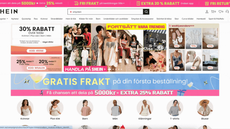
Shein’s landing page experience. If this is not overwhelming, what is?
As you arrive at an ultrafast fashion brand’s landing page, it’s an immediate visual assault. Everything is flashing, moving, popping up, in bright colors. And of course, everything is on sale.
Since ultrafast fashion companies (like Shein and Fashion Nova) offer dirt cheap, throw-away clothing, they need to sell massive amounts to turn a profit. They rely on users buying impulsively, filling their carts with unplanned purchases.
They use overwhelming and confusing discounting strategies purposefully to maximize impulse purchases. Let’s look at 5 psychological principles (priming, confusion, overwhelm, dopamine and urgency) behind this technique to understand why it is so prevalent in current e-commerce design.
PRIMING
Boohoo’s landing page (also an ultrafast fashion company)
When the user arrives at the landing page and the only thing they see is discount upon discount and prices scraping the floor, it primes them to think that this brand only offers the deals. Everything is a find here, every piece added to the cart is value for money. Technically saving money with every purchase.
This framing makes it easier for the user to justify adding things to their basket that they don’t even need or originally did not intend to buy.
CONFUSION
Fahion Nova’s 30% + 40% + 50% discount
Everything is 50%, then the same everything is 40%, then again, everything is 30% off on Fashion Nova’s website….so what exactly is discounted at what rate? Do these discounts add up?
120% discount…does that mean Fashion Nova will pay the user to get the items?Or does this mean the user is only paying 21% of the item (50% off, then 40% off that and then 30% off that)50% off then 40% off then 30% off
Clearly neither. If you look closer, Fashion Nova does say which categories the discount is for. But it is no accident that “40% OFF EVERYTHING” is bolded, highlighted with yellow and centred in the middle of the picture exactly where the model is.
They know how people read these visuals: eyes are drawn to the main element of the picture (the model) and the bold, yellow letters grab the attention. It is likely that the user scrolls past the text on the top.
Someone made the deliberate design decision not to make it easy for the user to understand what the discount is for.
If they wanted to be clear and straightforward, they could have done this:
Or to make it even clearer, like this:
And to strengthen my case even further, here is another example of their deliberately confusing discounts. Buy one free, get one free…what do you even mean?
So, how does this lead to excessive shopping?
When there are so many, seemingly overlapping, discounts, plus additional coupon codes to get yet another % off at the end, it is difficult to keep track of what costs how much and predict the final price while shopping. Throwing everything into the basket and seeing the total at the end is easier. Of course, the chances of buying something impulsively increase once it is in the basket.
OVERWHELMING
On top of the already confusing and misleading information display, everything is moving, blinking, and popping up. A dozen things are trying to grab the user’s attention at the same time.
Again, deliberate design decisions. All this could have easily been static, but overwhelming the user is a feature, not a bug.
As long as the user’s mental capacity is taken up by making sense of the available deals and absorbing the visual assault, there is less mental capacity left to think through purchase decisions. This intentionally overwhelming experience distracts users from asking questions like “Do I actually need this thing?” and intends to put them on shopping autopilot.
DOPAMINE EFFECT
We love a good bargain hunt. One article explains:
Entering a favourite store or logging onto your favourite shopping website is the catalyst. This very action tells your body that it should start producing greater amounts of dopamine, a neurotransmitter in the brain that makes it feel good to keep shopping and searching for pleasure and rewards. […]Shopping “is kind of like a treasure hunt,” he says. “The search itself is highly motivating.
Bargain hunting keeps us on our toes, we never know when we are going to find the next amazing deal. So we keep scrolling, keep clicking on items, fuelled by the thrill that the next item might be the best deal. And of course, impulsively buying that deal is also part of the journey.
URGENCY
Obviously, discounts are temporary so whenever there is something on sale, it immediately creates a sense of urgency: we have to take advantage of this deal before it’s too late. We don’t want to miss out on buying a T-shirt we will never wear for $5 instead of $10!
This feeling of urgency multiplies when there is a countdown clock involved.
AND THE DISCOUNTS ARE NOT EVEN REAL
These discounts are not only deceptive because they intentionally exploit mental shortcuts and trick users’ brains into impulse buying things, but also because they are presumably fake. If all these discounts were “real”, it would mean these companies are losing money since they don’t sell almost anything at their intended full price. Yet, ultrafast fashion brands are thriving. Just look at Fashion Nova’s CEO buying one of the world’s most expensive houses for 141 million. Clearly, discounts are not hurting these brands’ bottom line. These are the exact prices they want to sell the items on disguised as generous discounts and the deals of a lifetime.
Nevertheless, the psychological impacts of aggressive discounting still work and many users fall victim to those.
THE BIGGER PICTURE — the environment and user’s well-being
For a sustainable future and a balanced life, where our primary goal is not to outconsume our insta friends, our relationship to material consumption needs to change. We need to buy less.
As designers, we must use our influence for a positive impact. We need to be at the forefront of facilitating and advocating for mindful consumption. For the planet and the sake of our users.
We must stop designing for excessive consumption and start designing for mindful consumption. This means removing persuasive and deceptive designs like those listed above and giving the users time and space to make thought-through decisions.
We have a choice! Even fast fashion doesn’t have to be so aggressive about discounts as demonstrated by other fast fashion brands.
Alternative to aggressive discounting
For example, Weekday, which is still a fast fashion brand being part of H&M group, only shows 2 discounts on its landing page and the “deals” section in the menu is not even highlighted in any way.
Weekday’s landing pageWeekday’s menu unfolded, to find the deals section
Or Arket, which is technically still fast fashion as it belongs to H&M but branded as catering to slow lifestyle, does not even mention discounts on their landing page. What’s more interesting is that the language of discount is also not straightforward. In the menu, there is an item called “Previous Collection” which only implies lower prices since items are from last season. Plus the red colour is also a hint to the discounted prices.
Arket’s Previous Collections menu item
IN CONCLUSION
The current way of designing for excessive consumption is unsustainable and unethical. As designers, we need to recognize our impact on the planet and the user and start designing for mindful consumption. And just by being less aggressive with discounts, we are taking steps in the right direction.
Hi, I’m Anna, UX Researcher by profession and advocate of mindful consumption by design by passion. I drive the concept of Kind Commerce to raise awareness about the rarely discussed topic of design’s role in encouraging excessive consumption. You can follow me on LinkedIn for shorter blurbs about this topic, on YouTube for more consumer-facing content, or on Substack for other interesting bits and pieces about design, business and sustainability. Let’s make the world a little better together!
Thumbnail
The psychology of deceptive discounting in UX was originally published in UX Collective on Medium, where people are continuing the conversation by highlighting and responding to this story.


