

Make your website feel more luxurious using a simple CSS trick.
Introduction
People who read a lot of books know that paperbacks get read faster, they get shoved into backpacks, they get dirty and folded around, but they sure enough get read.
In contrast hard cover books are more luxurious, they are for a reader who wants to take his time, to enjoy the reading process. Hard covers get read at night in bed, or by the fireplace.
When a hard cover book is finished, when it’s all read and done, it still looks like new, and that’s why they are more sought after by collectors and enthusiasts alike.
Your website can feel more luxurious too, like a hard cover book, by using a simple trick, that only iOS users will see, you can change the color of the bit that extends to the top and bottom, you can decide, with simple CSS tricks — to delight your mobile users.
And like a good hard cover, your users will feel it, you don’t want your users to come to your website only for the content — like a cheap paperback.
Your website should be an experience, not just data.
Simple Safari website extensions
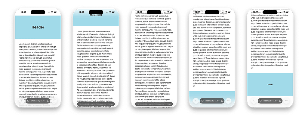
What we are talking about here is how iOS Safari will extend your website at the top — behind the status bar, and at the bottom — behind the tab bar.
In the image above you can see what you get if you do nothing, by default iOS will extend your content to the top and bottom.
Where your website ends, like above the header and below the footer, Safari will just extend your website’s body background-color, which is white by default.
If your website has no explicit body background-color, it can also be inherited from the html tag itself, though I think it’s simpler to just add a body background-color.
Here’s the CodePen Demo (See the code):
And the Preview (Open on your phone):
Let’s make this better
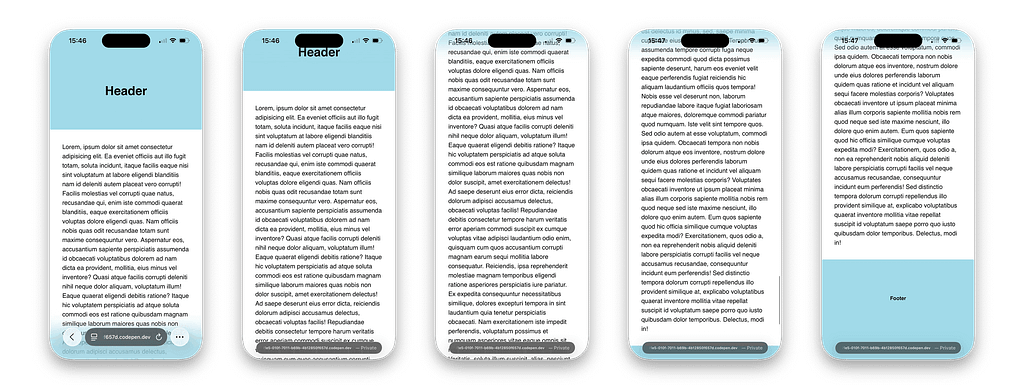
In order to make it better, we can just add this line of CSS to the body (see below), and of course we’ll need to add background-color: white to the actual content section of our page.
body{
  background-color: lightblue;
}
This already makes it a bit better because it makes the Safari extend at the top to connect with our header and at the bottom to connect with our footer.
But this solution is forcing us to extend the top and bottom to the same background-color, and sometimes that’s not ideal.
Here’s the CodePen Demo (See the code):
And the Preview (Open on your phone):
Extend Safari with different colors
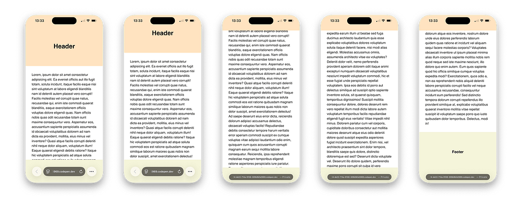
This is the greatest hack in order to get iOS Safari to extend to different colors at the top and bottom.
It includes making new .top and .bottom elements that should be fixed in their position, I implore you to study the CodePen below to learn more.
This should only be done in specific situations where the header and footer have different colors, but also when it’s important to the overall user experience.
Here’s the CodePen Demo (See the code):
And the Preview (Open on your phone):
A realistic middle ground
The hack I suggested might be too complex for most websites to implement, and realistically most websites don’t really need the different colored bars at all times.
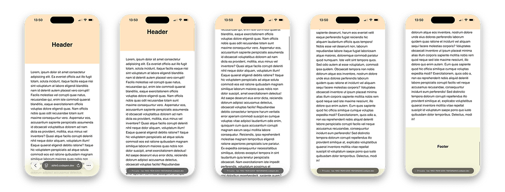
This example (see image above) is simpler, both to implement and to look at from a user experience point of view.
In this demo, all we have is the .top element, the bottom gets its color form the body in inheritance, so most of the time will see the content extends to the bottom, instead of a hard colored bar.
Here’s the CodePen Demo (See the code):
And the Preview (Open on your phone):
A disclaimer
Everything I wrote here was tested on both Mac Safari and iOS Safari, both running under MacOS 26 and iOS 26 respectively.
Every hack here could be less effective in future versions or straight up won’t work, only time will tell.
Thanks for reading to the end 🙏
If this helped you in your own projects, please tell me so in the comments below, I read them all.
The CSS hack that extends your website on iOS Safari was originally published in UX Collective on Medium, where people are continuing the conversation by highlighting and responding to this story.


