
Building an advanced design system for true white-label products with full control over colours, typography and visual styles
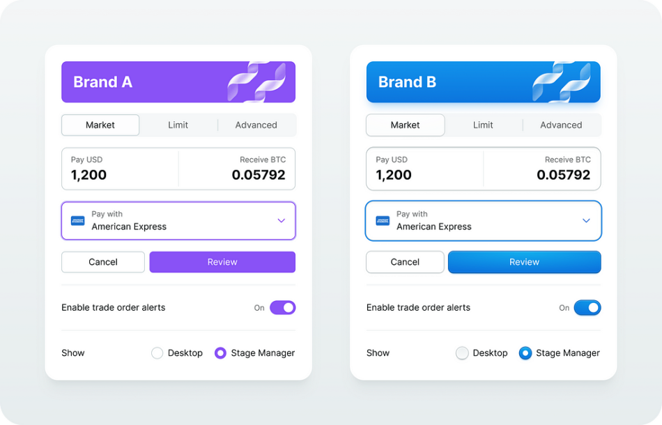
Same design system, different brands
TLDR
This is my journey to build a single design system for multiple brands, platforms or products. It’s less about the system itself, but more about tools and workflows to make it work.
In this article, I am going to go very technical and methodical about delivering such a system.
Tools
Source Foundation is a Figma plugin to manage colours, spacings and typography tokens. Plus it has several utility commands to support other workflows like swapping variables, fixing layers and importing/exporting component styles.
Workflows
Everything revolves around automation to quickly adapt the Source System for specific needs.
Fork
The idea is to copy the master file and have a safe room to experiment and design for a specific need.
Customize
It is all about tools that make customisation a breeze. The Source Foundation plugin changes colours, spacing, radii, typography and component styles.
Finetune & Publish
Final touch. This is where you give it a soul.
Results
Design system file (Figma file)Figma pluginTokens (Git Hub repo)Branding samples (Figma file and prototype)Crypto Trader Pro (Figma file)
Live Demos
Crypto Trader Pro (Figma prototype)Branded components demo (Figma prototype)Source Foundation Dev Docs (Website)
Let’s dive in!
The Idea
I’ve been pursuing a multi-brand design system for a few years now. And as I got more experienced and our tools became more advanced I feel like I got very close.
The route I took was to have a single master file with all the components, styles and variables. To get started with a new project I would copy that file and customize it per project needs. The copy gives a safe place where I can mess around with design elements with no effect on the master library.
In a nutshell, it’s like a forking repository or CodePen project.
Single source file for multiple clients or projects
For backward compatibility, it is important not to change the component structure in those copies and to keep the naming convention. For long-run projects, it enables me to upgrade designs with newer versions whenever there is a need to do so.
Challenges
While creating copies is easy, changing the entire system is hard. A designer could do it by hand for sure, however, it’s a repetitive process that lacks creativity and this is where I saw an opportunity to automate the process.
I wanted to alternate a few core aspects of the design language with ease.
Colour palette
I wanted to have full control over neutrals and accents with an ability to fine-tune both light and dark modesTypography
There should be a way to choose the typography scale and base font sizeSpacing
Wide range of scales to design for native desktop, web and mobileRadii
A few presets from conservative to more playfulElevation
Up to six elevation levels should do the trickComponent styles
The goal was to enable a variety of different visual styles on core design components like buttons, dropdowns and form elements.
Colour palette
This is the most challenging one to master. It was the most fun to solve.
The workflow around palettes is always the same.
Pick primary coloursCreate shadesCheck accessibility aspects
I did not want to do it by hand every time I needed a different theme, I wanted a fully automated process where I could drag some handles to get the new thing.
I already have a solid colour system that works for me and dozens of other designers in my company.
Now I needed a way to change the palette with little to no manual labour.
To tackle these challenges I created a Source Foundation plugin for Figma that does all the groundwork around managing the colours.
Source Foundation palette controls
It gives you full control over semantics, neutrals and accent colours. It was made with accessibility in mind, all the accents pass WCAG 2.2 with a minimum 4.5:1 contrast ratio. And, most importantly, it is fun to use.
There is a live demo where you can play with different colour themes and other aspects of the design → https://namad.github.io/source-foundation-docs/.
Typography, spacing and radii
These are important aspects that influence the overall size of the UI elements and their tone.
UI Scale settings in the Source Foundation plugin for Figma
I made it straightforward with multiple sets of design tokens. You pick a set that matches project needs and the plugin does the rest.
Component styles
Component styles define the look and feel of all core components in the system. Would it be flat? Or maybe a bit shiny? Raised or lowered? How about making it a bit bumpy?
Flat and effect-heavy UI elements are coming from the same source
As a designer, I wanted to have a flexible and easy-to-maintain style system that I could adapt for any client on any platform with a plug-and-play workflow. CSS-like classes if you will.
The concept
To make it work I need to decouple components and their styles. It’s like creating CSS classes for buttons, dropdowns and forms but using Figma components. I call them style components.
The style component represents a reusable UI element style and it is very similar to the CSS class.
Button layer structure
In Figma, the style component instance is absolutely positioned and it sits behind the content.
This way I can reuse this visual layer over and over again to style similar components in a consistent way.
All form elements use the same style
There is another interesting side effect. Because it is a component instance I can easily swap it with another instance which opens the opportunity to provide multiple style options for my components.
For example, the search box is a regular input that uses a different style.
The search box uses an alternative style
My absolute must-have would be the following:
Common UI element
A base style for all interactive UI elements that are clickable, hoverable and selectable. Things like menu items, list items and nav items.Buttons
Default, primary, destructive and ghost buttonsForm controls
Inputs, checkboxes, radio buttons and toggle switchesFocus visual
Re-usable and consistent focus visual that I can apply to any element I likeOverlays
Styles for modals, dropdowns, toasts and pop-overs
Style component structure
It’s a good idea to keep a consistent structure for the style components. It makes it easier to maintain and replace layers whenever I need to.
After multiple experiments, here is what I ended up with.
Base style component layer structure
Let’s break it down.
The background layer is for the main colour and layer effects to apply. The background image layer inside does the same job as a background-image property in CSS.The drop shadow component is a custom-made elevation effect to support colour bleed shadows. This way I can change the shadow colour however I like without creating a dedicated effect style in Figma. And I can even change the shadow blending mode too!
The image below illustrates what I can get using the base style component with only a few colours.
Custom style made with the base style component
Let’s not forget about the dark mode.
Dark mode preview
Visual States
All interactive elements must have visual states. I use component variants to implement that.
Here is for example my primary button style.
Primary button style component
And this is the form element.
Form element styles
Colour Adjustments
A very important feature in modern UI development is the ability to modify colours which is a great way to simplify the colour palette.
For example, in CSS we can use color-mix() function and we can overlay any solid fill with gradients. All modern CSS pre-processors have colour functions in one way or another.
The issue is that Figma does not have that for styles and colour variables. To overcome this limitation I have to rely on special design components and let the layers do the job.
Opacity
The ability to change any colour opacity is a must-have in our arsenal.
Currently, we cannot change the alpha channel for a colour variable alias in Figma. But we can change the layer opacity, there are even opacity variables for that. Once you set colours in separate layers it’s no no-brainer to make it work with anything you have in your palette.
Tints and shades
Tints and shades make the target colour lighter or darker.
In CSS there is a background-image property that creates a virtual layer on top of the solid fill. It allows overlaying the background colour with either gradient fill or with an image.
In Figma, I am going to use layers to get similar results.
It works the same way as CSS does. There are a few real-life examples of how it works for the web → https://namad.github.io/source-foundation-docs/#colour-adjustments
Tints and shades of the same colour
And it’s cool because in CSS background images have background blend mode. So I can safely use the same modes on my background image layer and get somewhat consistent results. I think that “overlay” does wonders and produces much cleaner results.
Tints and shades made with overlay blend mode
Gradients
To make a gradient we blend multiple colours.
To implement that in Figma I use a gradient mask to have a CSS-like linear gradient.
There is an example of how it translates into HTML+CSS → https://codepen.io/oxn-krtv/pen/dywWGZq
These gradients are made by mixing two colours
This method works nicely, however, it requires an extended set of accents to make it work on both light and dark modes. To keep the palette concise I prefer to use monochromatic gradients on top of the solid colour and mix using various blend modes.
These gradients use overlay blend mode on top of the solid paint
This method produces nice-looking and clean gradients on top of any colour I choose. You can find more details here → https://namad.github.io/source-foundation-docs/#gradients
Now I can use these special components as colour functions or gradients on top of any solid fill I have in my palette.
Plug-and-play styles
This was the last bit to solve. I was after some sort of style sheets that I could apply on top of my components to completely change their look and feel. Preferably something visual so I can see the result beforehand.
Different style components in light and dark mode
I tried to do it manually but after a few runs, I found the manual flow too complicated and error-prone. It is much better to have some sort of automation thus I invented an effortless import/export workflow for the custom style libraries.
Automated In-File Style Templates
To export styles I just select the frame with the style components I and run the export command. The automation finds all components and replicates their layer structure in regular frames. It’s like a loose copy that I can re-apply back to the original component.
Now I can make as many presets as I like and apply them back with import automation. This automation transfers all properties and overrides from the preset back to live components completely changing their visual appearance.
And that’s all I need to do, my custom design system file is good to go.
Resume
Making true white-label systems is hard.
A few years ago as was struck by this video about teams trying to solve a very complex puzzle.
https://medium.com/media/4a337722512146ef72f7096ea9dcc3cd/href
It was exactly the moment when I began my journey to completely decompose user interfaces, realize all complex relations between all the moving parts and express it with my solution to the problem.
Since then I set the goal to design an entire Figma product, a system that is feasible and capable of serving multiple brands. It’s a combination of properly engineered design components, an advanced toolset and clear workflows.
Let me know what you think in the comments.
Making of true multi-brand design system was originally published in UX Collective on Medium, where people are continuing the conversation by highlighting and responding to this story.


