
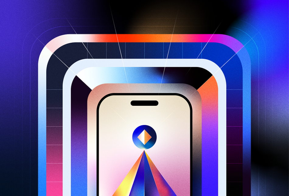
Elevating your user experience.
Image by author
Digital products like apps and websites started as counterparts to print media, offering similar content and functionalities, just in a different medium. But since then, these apps have evolved into dynamic experiences that not just fulfill a function but touch users on an emotional level. The key to transforming these digital platforms from mere tools to experiences lies in the subtle yet powerful realm of motion design.
Motion design breathes life into user interfaces, turning routine tasks into engaging and satisfying actions. It’s not just about furnishing the screen with animations but about rethinking each interaction with meaning and purpose. By integrating motion, everyday interactions are elevated into moments of joy and discovery, making the mundane magical.
However, the use of motion design in digital products is not just for aesthetic appeal. Motion also helps solve a lot of UX challenges. It gently guides users through the interface, simplifies complex information, and shines a light on updates without distracting them from the main content. Motion should no longer be considered an afterthought to elevate your designs, but rather a fundamental element for great UX.
Disney’s 12 Principles of Animation, originally a cornerstone for creating compelling traditional animations, serve as an invaluable guide beyond their initial intent. Though these principles were tailored for traditional animation, this article seeks not only to explore their adaptability and application within product design but also aims to offer a guide for designers to consider motion as an important element in crafting digital experiences.
12 Principles of Animation
Before we dive deeper, I highly recommend watching a 2-minute animation by Cento Lodigiani that brings these principles to life. This animation will be an excellent reference point, helping one understand how these principles can be translated into product design.
Squash and stretchSquash & Stretch applied to a UI card
“Squash and Stretch” gives flexibility and life to objects and characters in animation, conveying weight, volume, and elasticity. For instance, when a ball bounces, it stretches when it falls and squashes when it hits the ground, simulating the effects of gravity and impact in a lifelike way. When applied correctly, it helps to exaggerate movements realistically, making the animation feel more dynamic and alive.
Translating “Squash and Stretch” into digital design for apps and interfaces involves incorporating elements of elasticity and fluidity into UI elements. This adds aesthetic appeal and improves usability by making interactions more intuitive and satisfying.
This principle can be applied in various ways:
Button Interactions: Buttons can visually compress or stretch slightly when clicked, providing tactile feedback to users that their action has been recognized.Transitional Effects: When transitioning between different states or pages within an app, “Squash and Stretch” can make these changes feel smoother and more natural.
2. Anticipation
The notification icon pulses with anticipation, signaling fresh updates waiting on one’s profile.
This principle refers to the movement that precedes a main action, giving viewers a hint of what’s about to happen. For example, before a character jumps, they might bend their knees and lower their body, signaling their intention to leap.
By providing visual cues about what will happen next, anticipation helps users understand how to interact with the interface and guide them in the right direction. This helps reduce confusion, ambiguity, and cognitive load by making the flow of actions feel more natural. Anticipatory animations can also make interfaces feel more lively and responsive, captivate users, and keep them interested in the content.
Swiping on a tile reveals icons that guide the user on their next move — each gesture intuitively informs the action to be taken.
This principle can be applied in various ways:
Animated Icons: They can subtly hint at possible actions and outcomes, thus guiding and informing user interactions with visual elegance and clarity.Swipe Gesture Animations: In carousel or gallery views, partial visibility of the next or previous item can suggest the swipe direction, encouraging users to explore more content.Hover interactions: These interactions inform users that there is an action happening next for example, before a dropdown menu appears, a button might change color or slightly increase in size when hovered over, signaling an available action.
3. Staging
Clicking a song smoothly transitions to an expanded view, where key visuals are emphasized without overlap, showcasing the art of guiding attention through design and motion.
This principle uses visual composition to direct the viewer’s attention to the most important elements of a scene.
In digital interface design, staging translates into the careful arrangement and presentation of UI elements during a transition scene. It is important to keep in mind when you want to animate a particular element and how quickly during the transition. This choreographed entry helps to create a visual hierarchy that guides the users to the most important information or action. It would probably confuse the user if all the elements are animating at the same time & competing for attention. Hence, staging directs the user’s attention to the intended element.
Skeleton loading prepares the user for the content that’s about to unfold.
This principle can be applied in various ways:
Skeleton Loading: This loading technique strategically presents content placeholders, guiding users’ attention and setting the scene for what’s to come, enhancing anticipation and focus.Highlighting UI elements: Staging in UI design cleverly highlights crucial elements and directs users’ attention toward specific actions. By choreographing the entrance of the elements of a screen it ensures that key functionalities or calls to action are immediately noticeable.
4. Straight-ahead action and pose-to-pose
The “Straight-ahead action” and “Pose-to-pose” are two fundamental principles of classical animation that offer different approaches to creating motion sequences.
Straight-ahead action involves creating frames in sequential order from start to finish. Pose-to-pose, on the other hand, involves planning and creating keyframes (major poses) first and then filling in the intermediate frames later.
In the context of prototyping apps and digital products, the pose-to-pose animation principle is widely used to design and test interactions and transitions. This approach allows designers to focus on key states or “poses” of an interface and then smoothly transition between these states to simulate real-life interactions.
Figma’s Smart Animate feature is a prime example of pose-to-pose animation applied in digital product design. Designers can create different frames (poses) representing key states of an interface, such as a button’s default state, hover state, and active state. Smart Animate then automatically generates the in-between frames, creating a fluid transition between these states when previewing the prototype.
5. Follow through and overlapping action
The UI elements of the tab transition with staggered timing, each sliding in at its own pace for a dynamic and layered effect.
“Follow through” refers to the parts of a body that continue to move after the character has stopped their main movement. Overlapping action describes how different parts of an object or character move at different rates; for example, as a character starts to run, their legs might move before their torso and head catch up. These principles add a sense of weight, flexibility, and naturalism to animated characters and objects, making the animation feel more lifelike.
By integrating this principle into digital interfaces, designers can create more polished, engaging, and intuitive experiences. This layering of motion adds depth and dimension to interactions, making them feel more natural and engaging.
This principle can be applied in various ways:
Navigation Drawers and Menus: As a navigation drawer slides out, elements within the drawer (like menu items or icons) could begin their motion slightly after the drawer itself starts moving and settle into place after the drawer stops, creating a sense of depth and fluidity.Scrolling Content: In a feed or list, items can enter the screen with a slight delay between each other, rather than all at once. As the user scrolls, new content can “follow through” off the edge of the screen, while the content being scrolled into view overlaps in its entrance, creating a more dynamic scrolling experience.Animated Buttons: When a user interacts with a button, the button itself could scale down (follow through) and then back up, while the icon or label on the button might move slightly later or at a different speed (overlapping action), enhancing the feeling of interaction.
6. Slow In and Slow Out
With easing applied, the carousel cards glide smoothly creating a captivating flow with each swipe. (Inspired by Material Design’s documentation)
The “Slow In and Slow Out” principle of animation refers to the timing and pacing of movement in animation. This principle involves gradually accelerating the motion at the beginning (slow in) and then decelerating at the end (slow out), rather than moving at a constant speed. This mimics the natural movement of objects in the real world, where things need time to speed up and slow down, adding realism and fluidity to animations.
By adjusting the speed of an element at the beginning and end of its motion, designers can create a sense of weight and momentum that aligns with users’ expectations from the physical world. It gives a natural flow to movements within the interface, such as opening menus, expanding content, or transitioning between pages. This makes digital environments feel more responsive and engaging.
This principle can be applied in various ways:
Interactive Elements: Buttons or interactive elements can utilize this principle by slowly increasing in size or changing color when hovered over or clicked, and then gradually returning to their original state, providing a subtle yet satisfying feedback to user interactions.Modal Windows: When modal windows or dialog boxes appear and disappear, easing them in and out creates a more polished, less disruptive experience, seamlessly integrating the elements into the flow of interaction.Scrolling Animations: Implementing “Slow In and Slow Out” in scrolling animations, where the content starts moving slowly, speeds up in the middle, and then slows down before stopping, can make long scrolls feel more dynamic and less tiresome.
7. Arc
When UI elements follow an arc the motion feels more fluid & natural.
The Arc principle states that most actions in real life follow a slightly circular path, known as an arc. This principle is applied to ensure that movements appear fluid and lifelike, as straight-line movements can appear unnatural and mechanical.
Animations that follow an arc feel smoother and less jarring, providing a more pleasant and seamless user experience. By making movements more natural, the Arc principle can make digital interfaces more engaging and enjoyable to interact with.
This principle can be applied in various ways:
Drag-and-Drop: When implementing drag-and-drop features, the item being moved can follow an arc path, making the action feel more natural as if the user is physically moving it.Swiping Gestures: For carousel or swipeable card interfaces, implementing an arc motion as items are swiped away or brought into focus can mimic the natural movement of flicking through items, improving usability.
8. Secondary Action
The checkmark animates with ripples and sparkles on the confirmation screen, bringing a delightful touch that validates and celebrates the user’s successful purchase.
The “Secondary Action” principle of animation is about adding smaller movements or actions that support the main action to enhance realism and add depth to the animation. These secondary actions complement the primary action, adding layers of detail and richness without overshadowing the main focus. For example, as a character jumps (primary action), their hair might bounce or their clothes might flutter (secondary action).
Secondary actions make interactions more interesting and engaging, encouraging users to explore and interact with the interface. These details capture the user’s attention and can make ordinary tasks feel more interactive and enjoyable.
This principle can be applied in various ways:
Animated Icons: When a user interacts with an icon, the icon might perform its primary function (e.g., expand, collapse) while also including a subtle rotation or bounce to add emphasis and delight.Scrolling Effects: As the user scrolls (primary action), parallax effects or the subtle fading in/out of elements (secondary actions) can create a more dynamic and immersive browsing experience.Swipe-to-Refresh: In many social media or news apps, the primary action of pulling down to refresh the content is often accompanied by a secondary action, such as an animated icon that spins or changes color, indicating the refresh process is ongoing.
9. Timing
1: Enter transitions use longer times to stay or appear. 2: Exit transitions are quicker, demanding less focus than what’s next for the user. (Inspired by Material Design’s documentation)
Timing refers to the number of drawings or frames for a given action, which translates to the speed of the action. The more frames there are, the smoother and slower the animation will be.
Timing impacts how users perceive and interact with an app or website, influencing factors like responsiveness, engagement, and overall satisfaction. Smooth and appropriately paced animations can make an interface more enjoyable to use, encouraging longer interaction times.
Properly timed animations and transitions can make an application feel faster and more responsive, even if the actual operation times remain unchanged. The speed of animations can emphasize the importance of certain elements or changes within the interface, drawing the user’s attention where it’s needed most.
10. Exaggeration
A dynamic transition that brings the app to life with exaggerated, bold movements, making the final navigation step feel like an epic journey.
The “Exaggeration” principle of animation is about amplifying certain features or actions beyond their real-life counterparts to add emphasis, humor, or clarity to the animation. This technique helps in making animations more expressive and appealing, capturing the essence of what is being portrayed in a more impactful way.
In digital and UI interface design, exaggeration can be used to enhance user interactions and feedback, making them more noticeable and memorable. Exaggerated effects make important elements or feedback more visible and understandable to users.
This principle can be applied in various ways:
Achievement Celebrations: In gaming or fitness apps, achieving milestones can trigger exaggerated celebrations, like vibrant explosions of colors, oversized badges, or animated confetti raining down the screen, making success feel more rewarding.Navigation Transitions: Transition animations between different sections of an app can be exaggerated with bold, sweeping movements or transformative effects that make navigating the app feel like a journey.User Input Feedback: For text input fields, feedback on character limits might be exaggerated with the text box shaking or changing color dramatically as the user approaches or exceeds the limit, providing clear and immediate feedback.
11. Solid Drawing
The “Solid Drawing” principle of animation emphasizes the importance of creating three-dimensional forms in two-dimensional animation, ensuring that characters and objects have volume, weight, and balance.
Skeuomorphic design serves as a compelling example of the “Solid Drawing” principle’s application in digital interfaces. By applying textures, shadows, and gradients that mimic real-life materials and lighting, skeuomorphic designs create a sense of depth and tangibility that enhances user interaction and comprehension.
As we move forward into the realms of Augmented Reality (AR) and Virtual Reality (VR), the principles of skeuomorphism and Solid Drawing will play an increasingly crucial role. These environments aim to create immersive experiences that seamlessly blend digital and physical worlds, requiring designs that adhere closely to users’ expectations from real-world interactions.
12. Appeal
Appealing to users with a vibrant and dynamic animation that brings a digital badge to life.
The “Appeal” principle of animation refers to the creation of characters or designs that are pleasing and engaging to the audience. It’s about crafting elements that viewers find compelling, whether through charisma, design aesthetic, or emotional resonance.
In digital interfaces “Appeal” is about ensuring that the design not only meets the functional requirements but also provides a visually and emotionally satisfying experience for the user. The interactive elements that constitute the interface’s appeal can significantly contribute to the brand’s identity, making it recognizable and unique.
This principle can be applied in various ways:
Engaging Onboarding Experiences: Crafting an onboarding process with engaging illustrations, animations, and clear, friendly language makes the initial interaction with the app more appealing, setting a positive tone for the user experience.Interactive Elements: Incorporating interactive elements like animated buttons, swipe gestures, and feedback animations can add an element of fun and appeal, making routine interactions more engaging.Animated Illustrations and Graphics: Unique illustrations or graphics that reflect the brand’s style and personality can make an app stand out, creating a strong visual appeal that captures the user’s interest.
In conclusion, the translation of Disney’s 12 Principles of Animation into product design is not just about bringing visual delight to digital interfaces; it’s about crafting experiences that are intuitive, dynamic, and deeply engaging for users. By applying these concepts, designers can elevate the functionality and aesthetic appeal of digital products, making interfaces that not only look captivating but also feel alive and responsive to user actions.
References
Material Design — MotionIBM Design Language — AnimationCompelling and Moving: A Guide to Motion Design PrinciplesCreating Usability with Motion: The UX in Motion ManifestoMicrointeractions: The Secret of Great App DesignGood to great UI animation tipsDisney’s motion principles in designing interface animations
Disney’s 12 principles of animation, exemplified in UX design was originally published in UX Collective on Medium, where people are continuing the conversation by highlighting and responding to this story.


