

A translation guide for designers who think accessibility is a separate skill set
Every year, WebAIM crawls the home pages of the top one million websites and runs them through an automated accessibility scanner. The 2026 results, published this spring, found errors on 95.9% of home pages, averaging 56 detectable accessibility barriers per page. That number actually went up from the year before, reversing six straight years of slow improvement.
Here’s the part that should stop every designer in their tracks:
the six most common failure types haven’t changed in seven years of this report.
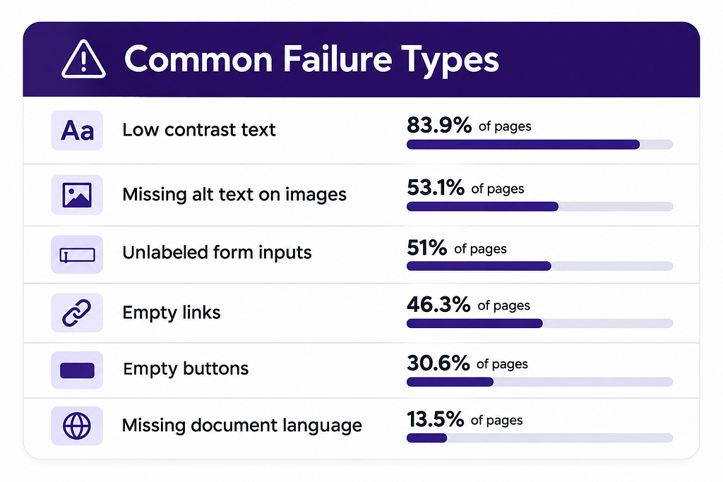
Now read that list again as a designer, not as a compliance officer.
Contrast. Labeling. Meaningful content in interactive elements. A document that actually declares what it is. None of this is accessibility exotica. It’s first-semester design fundamentals, the stuff any trained designer was taught to care about long before anyone ever said the words “WCAG” or “Section 508” out loud.
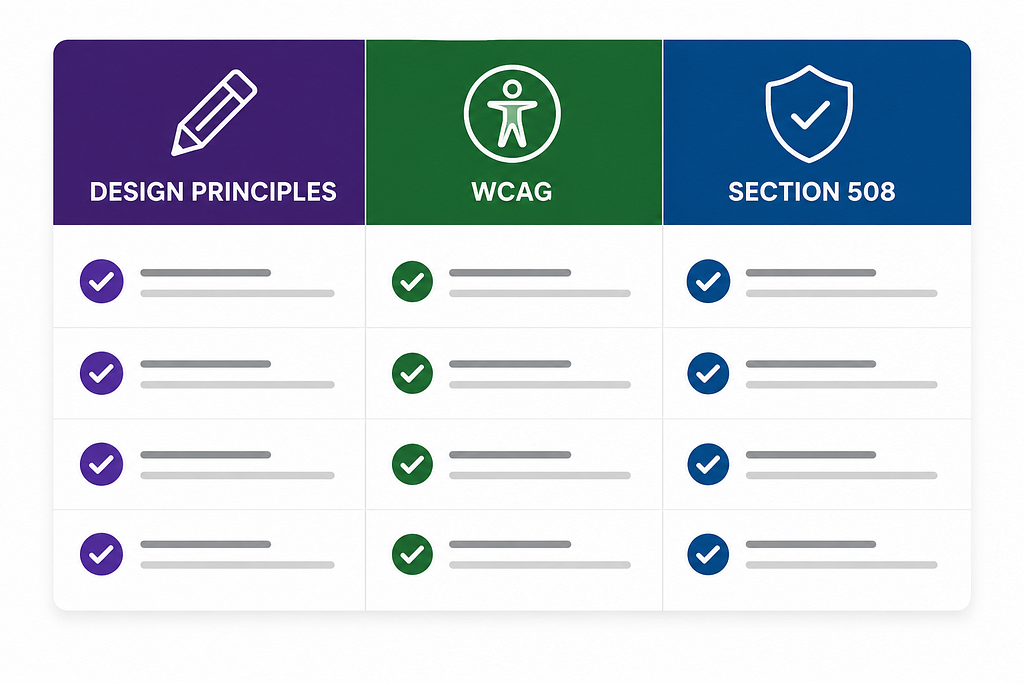
That’s really the whole argument of this piece: accessibility standards aren’t a new discipline bolted onto design. They’re a legal and technical translation of design principles good designers already practice. The gap isn’t knowledge. It’s vocabulary. Once a designer sees the 1:1 mapping, the standards stop feeling like an outside checklist and start feeling like a language for something they’ve been doing all along.
Here’s that mapping.
- VISUAL HIERARCHY
Design Principle: guide the eye through content in a deliberate order.
WCAG: 1.3.1 Info and Relationships; 2.4.6 Headings and Labels.
Section 508: Federal Law and Policy.
Missing in practice: 41.8% of pages skip heading levels; 18.1% have more than one <h1>. The hierarchy exists on screen but not in the underlying structure. - CONTRAST
Design Principle: text needs to be legible against its background.
WCAG: 1.4.3 Contrast (Minimum).
Section 508: Same as WCAG.
Missing in practice: the single most common failure on the web, 83.9% of pages, about 34 instances per page on average. - MEANINGFUL LABELS
Design Principle: a field should say what it wants.
WCAG: 1.3.1 Info and Relationships; 3.3.2 Labels or Instructions.
Section 508: Same as WCAG.
Missing in practice: one in three form inputs on the average home page (33.1%) has no programmatic label. - DESCRIPTIVE, PURPOSEFUL IMAGERY
Design Principle: an image should communicate something, not just decorate.
WCAG: 1.1.1 Non-text Content.
Section 508: Same as WCAG.
Missing in practice: 16.2% of images are missing alt text entirely, and another 10.8% have alt text so generic (“image,” “graphic,” a filename) that it says nothing at all. - CLEAR AFFORDANCES
Design Principle: a button should look and behave like a button, a link like a link.
WCAG: 2.4.4 Link Purpose (In Context); 4.1.2 Name, Role, Value
Section 508: Same as WCAG.
Missing in practice: 46.3% of pages have empty links and 30.6% have empty buttons, controls with no discernible purpose to anyone, sighted or not. - PREDICTABLE, CONSISTENT NAVIGATION
Design Principle: the same pattern should work the same way everywhere.
WCAG: 3.2.3 Consistent Navigation; 3.2.4 Consistent Identification
Section 508: Same as WCAG.
Missing in practice: design-system inconsistency is exactly what this criterion penalizes, components that drift, visually or functionally, from page to page. - CONTENT THAT ORIENTS
Design Principle: establish context before asking for action.
WCAG: 3.1.1 Language of Page.
Section 508: Same as WCAG.
Missing in practice: 13.5% of pages don’t declare a document language, which breaks screen reader pronunciation and translation tools entirely. - RESTRAINT WITH NOVEL INTERACTION PATTERNS
Design Principle: don’t invent a new pattern when a standard one works.
WCAG: 4.1.2 Name, Role, Value (custom components); ARIA Authoring Practices.
Section 508: Same as WCAG.
Missing in practice: pages using ARIA averaged 59.1 errors vs. 42 on pages without it, more custom interaction complexity means more chances to get the underlying semantics wrong. 22% of ARIA menus lacked the markup needed to actually function as menus. - ERROR PREVENTION AND GRACEFUL RECOVERY
Design Principle: help people avoid mistakes and recover from them without shame.
WCAG: 3.3.1 Error Identification; 3.3.3 Error Suggestion.
Section 508: Same as WCAG.
Missing in practice: this one maps directly to standard usability heuristics, basically Nielsen’s “help users recognize, diagnose, and recover from errors,” just given legal teeth. - SKIMMABLE, WELL STRUCTURED CONTENT
Design Principle: headings and landmarks let people jump to what matters.
WCAG: 1.3.1 Info and Relationships; 2.4.1 Bypass Blocks.
Section 508: Same as WCAG.
Missing in practice: only 46.1% of pages have a <main> landmark, and only 17.1% offer a skip link. One in ten of those skip links is broken. - DESCRIPTIVE MICROCOPY
Design Principle: link and button text should say where it goes, not just “click here.”
WCAG: 2.4.4 Link Purpose (In Context).
Section 508: Same as WCAG.
Missing in practice: 15.2% of pages have ambiguous link text like “click here” or “read more,” averaging 5.3 instances per page. - PLAIN, CLEAR LANGUAGE
Design Principle: write for the reader in front of you, not for yourself.
WCAG: 3.1.3 Unusual Words; 3.1.5 Reading Level; 3.3.5 Help.
Section 508: Same, reinforced by the federal Plain Writing Act for government content.
Missing in practice: WCAG’s automated tools can’t score reading level directly, which is exactly why this one gets skipped, no error count nags anyone about it. It’s invisible in a scan and enormous in real-world impact.
A quick note on “Section 508”: since the 2018 Refresh, the federal standard no longer keeps its own separate technical criteria for web content. It points to the same rulebook everyone else uses, incorporating WCAG 2.0 Level A/AA by reference, and most agencies now hold themselves to the newer 2.1/2.2 version as the practical bar.
“Section 508 compliant” and “WCAG 2 A/AA conformant” are, for nearly every practical purpose, the same target. That’s worth saying plainly, because a lot of designers think of these as two separate rulebooks to learn, when for digital products they’ve basically merged into one.
Data source: WebAIM, “The WebAIM Million” (2026), webaim.org/projects/million
Why this framing matters
The WebAIM data makes an argument you can’t really make with a checklist alone: these failures cluster around the exact areas where “just design it well” already gets you the answer. Contrast, labeling, hierarchy, affordance, consistency: none of this requires a designer to learn a new skill. It just requires the designer’s existing judgment to actually survive the trip from comp to production.
You don’t need to become an accessibility specialist to close most of this gap. You need to:
- Insist that your visual hierarchy survives into real heading markup, not just font-size styling.
- Treat contrast ratios as a design constraint, with the same seriousness you’d give brand color.
- Write real link and button copy instead of “click here” and empty icon buttons.
- Write alt text that actually describes what the image communicates, not just what it depicts (a purely decorative graphic gets alt=””, a chart gets a meaningful description of what it shows).
None of that is compliance work tacked on top of design. It’s just design work, finished properly.
Why designers, and why early
There’s a reason this matters so much at the design stage specifically, and not just at QA or launch. Every one of the issues in that table is far cheaper to fix in a Figma file than in shipped code. A contrast problem caught in a design review is a token swap. The same contrast problem caught after launch is a ticket, a sprint, a regression test, and a developer annoyed at rework nobody budgeted for. A missing label caught while a content designer is still drafting form copy is a two-minute fix. The same gap caught by an auditor six months post-launch can mean a remediation plan, a legal risk assessment, and a much less pleasant conversation with leadership.
Designers sit upstream of nearly all of this. That’s exactly why designers, more than any other role in the process, are positioned to make accessibility cheap instead of expensive. Not because they’re accessibility experts. Because they’re already the ones making the calls about hierarchy, contrast, labeling, and content, long before a single line of code gets written.
So here’s the confidence-building part, because a lot of designers feel intimidated by “accessibility standards” as a category, like it’s a body of legal knowledge they haven’t been trained in and might get wrong. Look back at that table one more time. Every single row starts with something you already know how to do. You don’t need to memorize WCAG success criteria numbers. You need to trust the instincts you already have, and treat “will this work for someone who can’t see color, can’t use a mouse, or is skimming on a screen reader” as just another design constraint, the same way you’d think about a slow connection or a small screen. It’s not a separate skill. It’s the same skill, applied a little further out.
Content designers: you’re already doing this too
Everything above focuses on interface and interaction, but there’s a whole other group of designers who are just as central to accessibility and often don’t realize it: content designers, UX writers, anyone shaping the words.
Plain language isn’t just good writing practice. It’s an accessibility intervention in its own right, for people with cognitive disabilities, for non-native speakers, for anyone reading on a phone at 6am before their first coffee. Short sentences. One idea per sentence. Familiar words instead of jargon. Clear instructions instead of clever ones. That’s WCAG 3.1.5 (Reading Level) and 3.3.5 (Help) in practice, even though almost nobody frames it that way in the writing room.
Here’s why this matters more than ever right now: a growing share of digital content is AI-authored or AI-assisted, and AI-generated text has a habit of drifting toward exactly the things plain language guidance warns against. It reaches for longer words when shorter ones would do. It nests qualifying clauses. It produces confident, fluent paragraphs that are genuinely harder to parse than they sound. None of that shows up in an automated accessibility scan, because reading level isn’t something a scanner can reliably score. It’s invisible in the data and enormous in the lived experience of the reader. That makes a sharp-eyed content designer, someone who edits AI output the same way they’d edit a junior writer’s draft, one of the most important accessibility roles in the organization right now. Not a nice-to-have. A frontline defense.
If you’re a content designer reading this and wondering where you fit into “the accessibility conversation,” the honest answer is: right at the center of it. You’ve probably been doing this work under the name “clarity” or “voice and tone” for years. It has another name too.
A structural note for your design system
If you run or contribute to a design system, this table doubles as a component-audit checklist. Every row maps to something a shared component can enforce automatically: contrast tokens, required label props, semantic heading levels baked into typography components, link and button components that simply reject empty content. Standardizing this once at the component level does more to move WebAIM-style numbers than any amount of individual designer diligence, because it removes the failure mode at the source instead of hoping every contributor remembers it every single time.
In closing…
If you’re a designer who has ever felt like accessibility is some separate credential you’re supposed to go earn, some badge you don’t have yet, I hope this article was a confidence boost. You’ve had this power the whole time!
That instinct to tighten a headline, to pick a color that actually reads, to write a button label that tells the truth about what happens next: that’s not a soft skill sitting next to accessibility. That is accessibility, wearing a name tag you never bothered to read.
Every designer who’s ever obsessed over whether text felt legible, or rewritten a sentence until it finally made sense, or gotten irrationally annoyed by a button that just says “Submit,” has been quietly practicing this the entire time. You didn’t need a certification. You needed a translator. Consider this it.
Go forth and use your powers for good. Turns out you had a cape in the closet the whole time.
BUT WAIT, THERE’S MORE!
And if you want to learn even more about accessibility or usability, here are some books to check out. A few are explicitly about accessibility, and a few aren’t, but they all feed the same instincts this article is about.
Accessibility and disability-inclusive design
- A Web for Everyone: Designing Accessible User Experiences — the accessibility field guide for designers specifically, personas and all.
- Design Meets Disability — on how disability has historically shaped some of design’s best ideas.
- Inclusive Design for a Digital World — a practical, UX-focused rundown of designing for a wide range of disabilities.
- Digital Accessibility Ethics: Disability Inclusion in All Things Tech — brand new for 2026, an ethics framework for disability inclusion built by 39 authors across 10 countries.
- Mismatch — exclusion is a design choice, not an accident.
Design, usability, and communication
- Don’t Make Me Think — the usability bible: if people have to think about how to use it, it’s not designed well enough.
- Information Anxiety— the classic on the gap between data and understanding, and why clarity is a design problem.
- Writing Is Designing — the content design case, in book form, for everything this article argues about words.
- 100 Things Every Designer Needs to Know About People — the psychology behind why good design decisions work.
You already know how to make it accessible was originally published in UX Collective on Medium, where people are continuing the conversation by highlighting and responding to this story.


